
BanBif — Credit Card Landing Page Optimization
Role
Product Designer
Scope
UX · Information Architecture · Landing Page · Conversion Optimization
Industry
Banking / Financial Services
CONTEXT & CHALLENGE
BanBif is a Peruvian bank competing in a highly saturated credit card market, where most products offer similar benefits and messaging.
The challenge was to improve the credit card landing page experience, helping users clearly understand the value proposition while increasing conversion through better structure, clarity, and decision support.
Insights
I worked as a Product Designer, responsible for defining the information architecture, validating content structure with users, and designing the landing page experience focused on clarity and conversion.
Defining the Problem
The existing landing page overwhelmed users with information while failing to clearly communicate why BanBif’s credit card was different.
Users struggled to quickly understand benefits, eligibility, and next steps, increasing friction and drop-off.
Information Architecture Strategy
Before moving into visual design, the content structure was redefined to prioritize clarity, hierarchy, and decision-making.
The goal was to guide users through a logical flow: understanding the value → evaluating benefits → taking action.
WIREFRAMES & FLOW
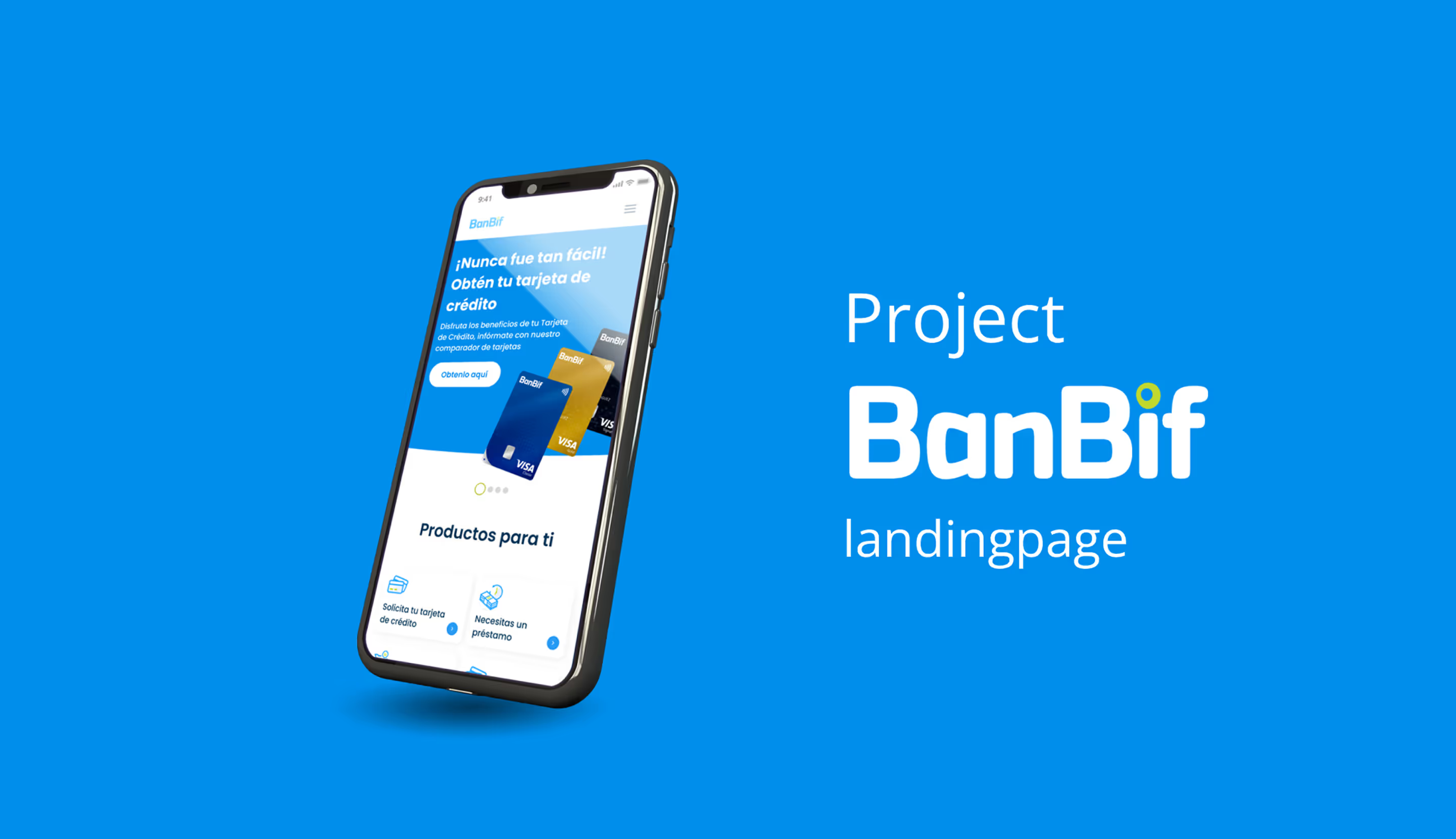
The final UI design reinforced clarity and trust, using a clean visual language aligned with BanBif’s brand while keeping the focus on benefits and conversion.
IMPACT & OUTCOMES
Impact & Outcomes
- Clearer value proposition for users
- Reduced cognitive load when choosing a credit card
- Improved content discoverability
- Stronger alignment between business goals and user needs
- Validated structure ready for iteration and optimization
REFLECTION
This project highlights the importance of separating structure from visuals in product design.
By validating information architecture before UI execution, the final solution was clearer, more focused, and better aligned with user decision-making in a complex financial context.
